
Good evening!
Uh. My apologies for the disappearance.
Yes, it has been just over three months (!!!) since my last post, which I do apologise for.
To tell the truth, I had actually intended to take a little bit of a break anyway. I had recently finished the Herculean task of getting DATING OF THE FUTURE Steam Deck verified, and there was very little else that I had planned to do with the game after that point.
As implied, however, I did NOT intend for the break to be this long. After all, I never even truly stopped working!
Since last summer, I have actually secretly been at work on an entirely new game project. It is still in extremely early development, but the plan was absolutely to have something out about it by now. What the hell happened?
Well, without going into detail, an unexpected change in life circumstances is what happened.
I don't want anyone to be worried--I am certainly perfectly alive and healthy, but the year did begin with a major tragedy for me, and it has made it very difficult to continue working on my secret project. It is in no way cancelled, but development has been on something of a hiatus since mid-February. I've been trying to get back to work, but I'm not super pleased with the results so far...
This new project is a little different to DATING OF THE FUTURE, so it absolutely has to make a good first impression. I can't afford to rush this!
I appreciate everyone's patience in the intervening time. Even though you guys had no clue I was actually working on anything else.
Now is a good time to remind all paying Patrons that there is little to no Patreon-exclusive content planned in the future. Thank you to all those who support me monetarily, but absolutely feel free to cancel if you're here for the exclusive content! My newsletters are always free!
Regardless, thank you to everyone who cares about the work that I do. Ever since I started the Discord server, I've had the pleasure of getting to know to so many of you. I couldn't be prouder to have such delightful, funny, and caring fans. It's always worth it if it's for you guys!
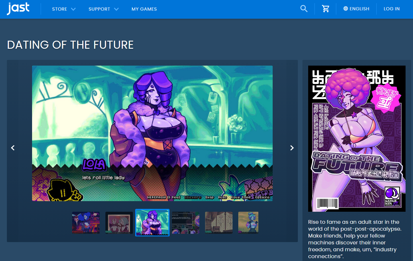
While I say I haven't been up to much for the past few months, that isn't actually strictly true. A surprising amount has happened with DATING OF THE FUTURE recently.
Okay actually that's less than I thought.
There are a few more minor things that I have planned in the near future (things on the level of the Steam community items, I mean), but there are presently still no plans for major updates or DLC. I just fucking told you I was busy one section ago. Holy shit you are so needy.
I understand that it's a little anti-climactic to have so little to say after such a long break, and I have to admit that I'm not sure when I will next have anything noteworthy to say. I thought that it was probably better to say a little now, than stay silent until I have more to announce.
The next time you hear from me, it might be a game announcement, but it might be another delay. I'm really sorry for the uncertainty!
As always, thank you so much for your continued support and patience. I hope you all have a wonderful evening.
Gordos are falling from the sky,
-Marina