
Good evening!
Progress is going smoothly on Callie's route, but has left me without much to comment on this month. As such, I've decided to make this news post a psychological thriller in which you, the reader, are subjected to the process by which I make the illustrated backgrounds for the game.
Indeed, this month it will be YOU who entertains ME! My, how the tables turn!
This post might CLAIM that it's March, but clearly... October came early.
Callie's route is planned out from beginning to end. The next step is to make all of (well, most of) the art that will be used throughout the route.
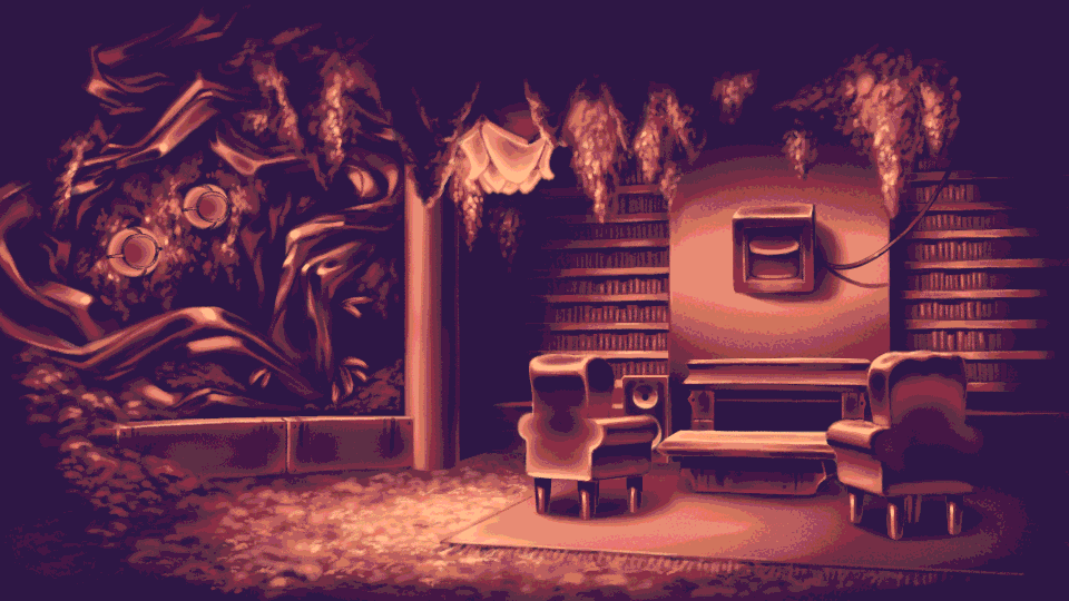
Out of a planned 12 new backgrounds, seven have been made. These are mostly for the major new area of the route, the Crimson Manor House. You can see one example of a finished background above.
... 12, huh? That's a lot. Did I really just not count them until now...?
Anyway, despite how many backgrounds are in the game, they are inarguably some of the toughest elements to implement. Thankfully, I've developed a streamlined process to get from concept to finished product! Wanna see?
Now, the "concept" I start with tends to form over the course of writing. In a visual novel, backgrounds serve three main purposes:
It might not look like it, but trying to hit just these three points in a single background can be a real pain in the arse; particularly in a visual novel, where environments can generally only be as large as the single shot that is used to establish them.
Over the course of planning a route's storyline, each background will slowly develop as an idea in my head, based on the events that it is planned to contain, as well as the context of the world around it.
Once I have an idea of the background in my head, I'll create concept thumbnails; being extremely careful about how I get across the three main points that a background needs to hit.
I've recently had to create a kitchen background for the Crimson Manor House. Let's use this as an example for how the process works.

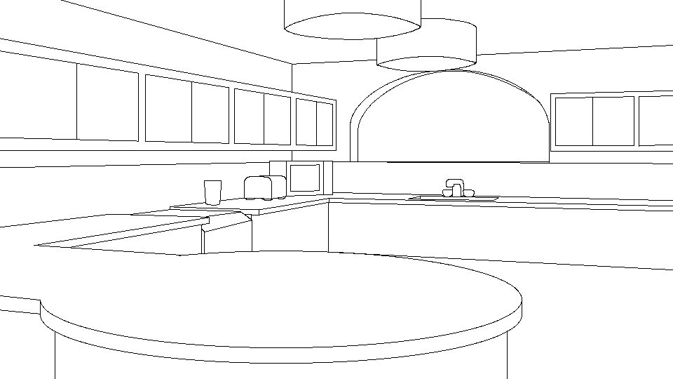
Of the many sketches I created, this is the one that I ended up settling on. It's a modern-looking kitchen with a breakfast bar, a knife rack, and a tap.
Er, at least I'm pretty sure that that's what I'm looking at.
The way that this sketch hits the three major points is relatively simple.
Providing context for the larger world tends to be the hardest part of creating backgrounds. In a visual novel, the "world" that forms in the player's head is conveyed entirely through little bite-sized glimpses into specific scenes. This puts a lot of strain on those small glimpses to provide context for what the player cannot see.
The Crimson Manor House, which has a number of very complex backgrounds that all stick to a consistent architectural style, will be quite sufficiently established by the point that the kitchen is introduced. This leaves a little bit of room for the kitchen to have more of a personality of its own.

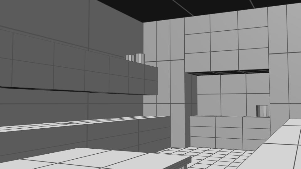
So, based on this sketch, I start modelling out the environment. This stage of the process is largely to establish measurements, distances, and finalise the camera angle in order to ensure that the final image is as effective as possible.
This stage can also highlight some problems with the design. As an example, it's here that I begin to feel as though the kitchen is too empty. There's a noticeable excess of floor space. This is largely due to the way that the breakfast bar has to cut across the room. Attempts to make it smaller end up making it less clear how the breakfast bar physically fits into the room.
Feeling some uncertainty about the direction that the design is moving in, I hedge my bets on the digital sketching phase to solve all my problems. This is where I plan out how the area will look in more detail, in preparation for blocking in colours.
It's at this stage that I realise that I hate the design.
It's vacuous, uninspired, and not very fun. Plus, I'm sort of at a loss as to what should be shown in the back window. It can't actually be a window, because this background needs to work independent of the time of day that it's shown at. Plus, windows REALLY aren't the style of the Crimson Manor House. Also, and this really frustrates me, it looks far too much like Sonja's kitchen from the game's third route.
What do I do in this dire situation? Obviously, I start the whole thing over again!

This time I'm going for a kitchen more accurate to that of an English manor house.
I draw from some reference images of some of my personal favourite manor houses and country houses. I also begin to think that adding an AGA-style cooker might be a striking centrepiece for the kitchen, while providing some interesting cultural context for the world.
Also, seeing that the breakfast bar sort of frustrates and constrains the design of the space, I decide to just turn it into a separate kitchen table. Not sure how the idea didn't occur to me sooner.
Based on elements from the new sketches, I do the modelling process again. The kitchen is looking a little cramped (due in no small part to the table), but I'd much rather it feel cramped than empty.
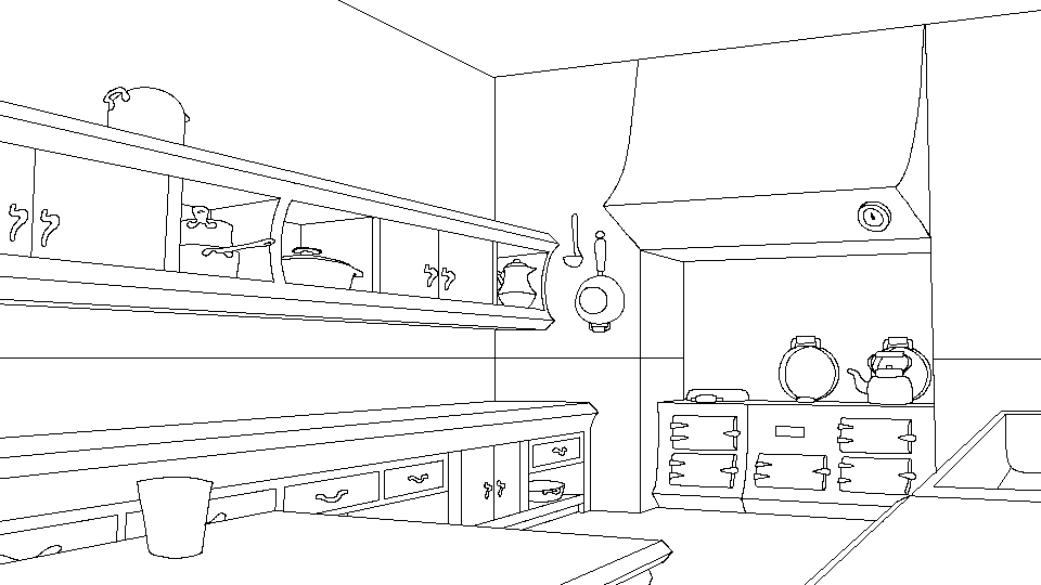
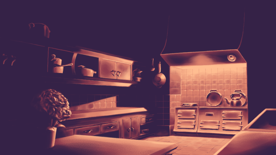
I do the digital sketching. As the design is finally coming together, I see fit to add far more detail to this version than the last. I seek out reference images for copperware kitchen implements, old kettles, and whatever else I want to add.
I also decide to add a bouquet of flowers to the table (currently the pot is the only visible element). This adds a little natural detail (a staple of the Crimson Manor House), while also keeping the countertop at the back from feeling bare.
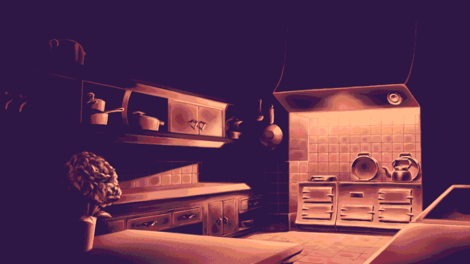
Next, I block in the colours. Since DATING OF FUTURE sticks to an extremely strict colour palette of four colours per image, the lighting becomes a much more important part of establishing the mood and feel of an enviroment. Every background in the Crimson Manor House draws from the same palette.
At this stage, I begin painting. This is the longest part of the process by a significant margin, despite probably also being the simplest.
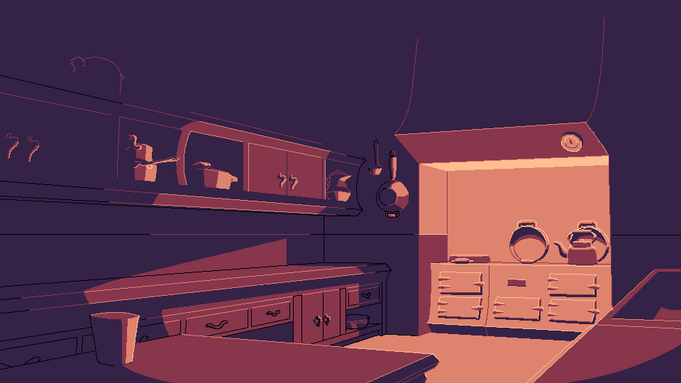
The fully painted image looks like this. This isn't the end of the process, however.
The final step for every painted element in DATING OF THE FUTURE is a process called "posterisation"; a specific kind of colour quantisation that restricts the colour depth of the image. This is easily applied to the final image, and lends it that striking, compressed quality that makes the game's backgrounds so distinct.
And there you have it! You now know how to copy me and steal my business.
I'll teach you how to draw breasts some other time.
Conclusion? What the hell is there to conclude? Well, except that I clearly need to get a fucking move on when it comes to painting more backgrounds.
No rest for the wicked,
-Marina