
Good evening!
This month's news will mostly focus on the suite of general improvements being made to DTF, as well as a brief touch on how the current route is going.
Last time, I discussed some of the findings of the DATING OF THE FUTURE Feedback Survey, which was bundled with the Steam Next Fest demo. There were a lot of interesting findings from this survey, and while I discussed some of them last time, I've spent the time since actually implementing a lot of their suggestions.
I thought it might be worth discussing some of the changes made to the user interface.
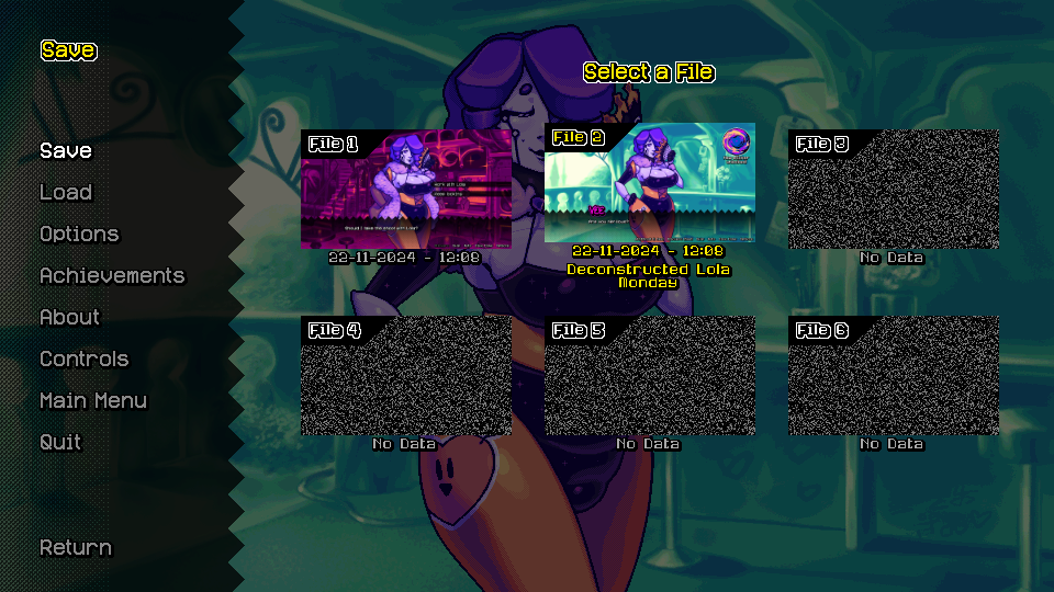
The save menu has been majorly overhauled.
A lot of players expressed confusion about why DATING OF THE FUTURE'S save system differs so greatly from that of other Ren'Py games. There are a lot of reasons for this, but the main one is that I greatly dislike Ren'Py's style of saving.
Visual novels have a tendency to be... Unfair, if I were to put it bluntly. They can be incredibly unclear about the player's successes and failures. You can end up locked into a game over for a harmless decision that you made an hour ago, and the game will make no effort to let you know. I don't even like the idea of game overs or bad endings in visual novels to begin with, and part of the reason is because they quickly snowball into increasingly worse game design choices.
If you're wondering, this is why the game lacks a quicksave system. A professional product shouldn't need savestate hotkeys, nor should it need 200 of the world's most disposable save slots.
One of the most core philosophies of DATING OF THE FUTURE is that there is no lose case. EVER. The idea does not belong in a visual novel, particularly not when the choices are portrayed as being choices of self-expression, rather than tests of problem solving. This is why Ace Attorney can get away with it, but your average high school rizz-em-up cannot.
No players expressed disappointment at the lack of game overs.
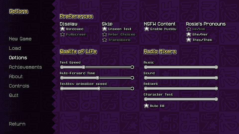
There's a new, improved look for the options menu.
Also note the addition of a slider to control the speed of the textbox animation.
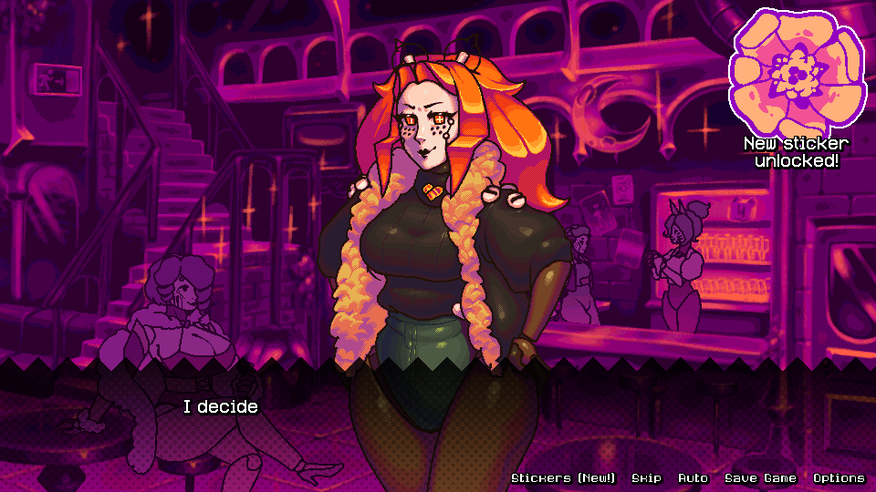
The game now tells you when you've unlocked new stickers.
Additionally, stickers are now labelled as "NEW!" until you select them from the sticker menu.
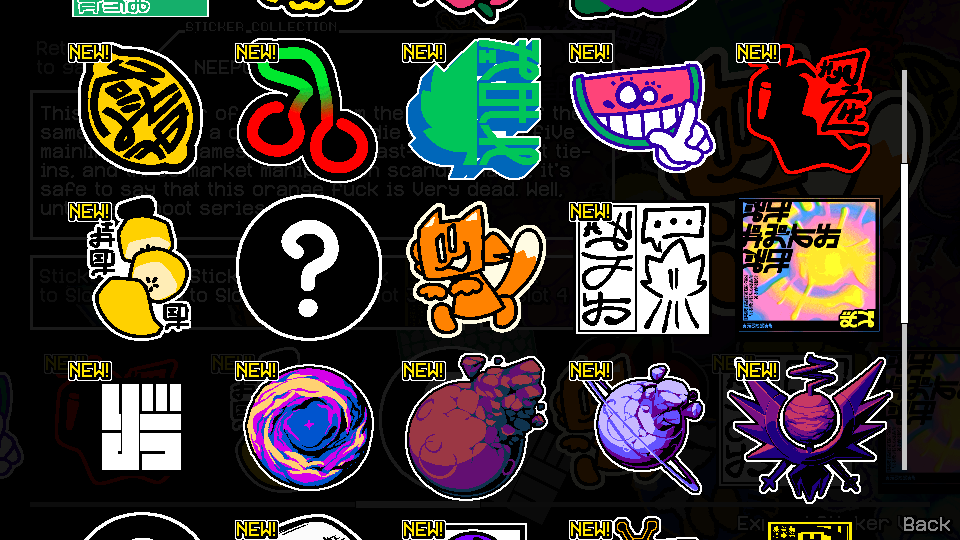
As shown here, the sticker menu also has a new sub-menu that displays the stickers in a grid, so you don't have to scroll linearly across all of them to get anything done. This is one area where I do not feel the need to compete with the recent Zelda releases.
Some players were confused about the Move & Talk system.
Most players liked the system, and only a minority expressed confusion about it. Even within this minority, there was disagreement over what exactly the problem was.
The way that I saw it, it didn't seem like anyone had an issue with the fundamentals of the system, it just wasn't immediately understandable to everyone.
For the uninitiated, the Move & Talk system is one of DTF's main mechanics.
Between linear story moments, the player will be asked to move to different locations from a menu to continue progress with the narrative. For anyone familiar with the Ace Attorney series, this mechanic might feel familiar. Those same people might also feel a little uneasy about its inclusion.
See, the goal of DTF has never actually been to create a challenging visual novel; certainly not in the same manner as the Ace Attorney games. The player is explicitly told where to go next, and ideally never spends a second being confused. That obviously begs the question: What's the point of being given a list of choices, if the game explicitly tells me which one I should pick?
Well, this is where the "Talk" side of the mechanic comes in. The player usually travels with other characters by their side, and every character (including just Vee by herself) has a unique line of dialogue for every selectable location in the game. Players that just want to move on with the story can just follow the game's instructions, and players that want to squeeze more interactions out of their favourite characters are rewarded for their curiosity. It's a win-win!
Naturally, new locations are unlocked throughout the game, so the scope of your options opens up as you progress through the game. This keeps the early routes feeling manageable, and provides more interactions for the characters that you picked the latest.
Whew! Forgive the speech. Now you understand exactly what the system is designed to do, you can understand where the presentation failed.
This is a screenshot from an old build of what the Move & Talk menu looked like--specifically while trying to move, and with most stations unlocked:
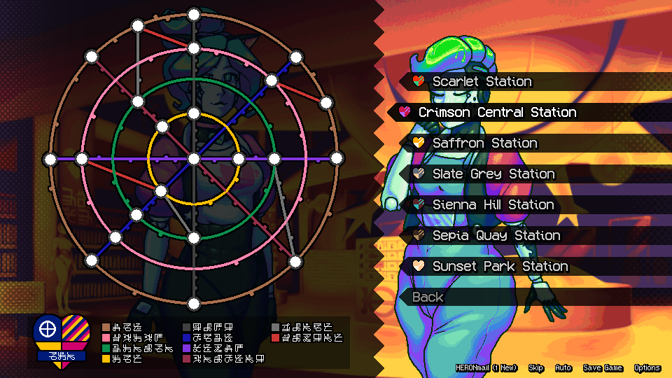
And here's a non-comprehensive list of player complaints:
These complaints are incredibly easy to understand. Let's start with the first.
The tube map draws too much attention, and doesn't make it clear enough that it is a simple visual flair to compliment the real menu, which is the one on the right.
Additionally, some players seem to be confused (at least initially) about the relationship between stations and locations.
The game has quite a lot of visitable locations, and it would be inefficient to put them all in one list. Instead, they are divided between "stations"; literally, the stations that Vee travels to via tube in order to get to those locations. There are a lot of good reasons for this to confuse players, and while no specifics were really given in this regard, my first guess was that it isn't immediately obvious that the the station menu leads into the location menu.
I mean, if a character says "Go to Gold Leaf Gallery!", and you're given a menu that tells you to go to click Slate Grey Station, you're probably going to be a little confused, even if for a second, about exactly what this interaction is.
Lastly, the game is intentionally designed to not allow you to see all character interactions for every location. If you do Lola's route first, you'll only unlock the HERON Museum after you're done hanging out with Lola forever, so their combined interactions are lost to the ether. For this reason, the game doesn't track completion for character interactions, and doesn't lock anything behind specific interactions (well, for the most part).
So... How did I fix this?
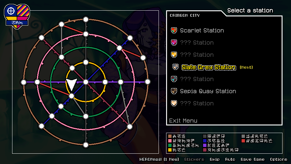
Here's the new menu. Pretty spiffy, huh?
To draw attention away from the map element, the darkest part of the menu is now the actual selectable menu element. Additionally, hovering over any station will directly point to its location on the map, indicating that the map is now subservient to the menu, not the other way around.
Stations that are not yet unlocked still appear on the map, making it immediately clear from the beginning that there are more stations to be unlocked, and that the system will develop over the course of the game. Hopefully this does double duty in implying that there are only so many places that players can go with any given character.
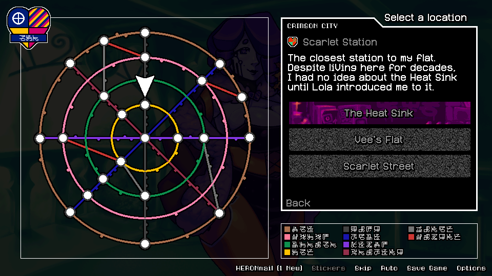
Here's a look at the menu once a station is selected (in this case, Scarlet Street Station).
The flavour text for the station does a better job of expressing the relationship between a station and its locations, as well as helping to ground the world in a more realistic sort of dimension.
Locations that have been visited before are indicated with static. While not visible on this menu, locations that are yet to be unlocked are labelled with "???" and are unselectable.
All in all, I believe these simple changes to GUI will go a long way to improve the game's conveyance for new players.
Sorry, I didn't realise how much I had to say about all that...
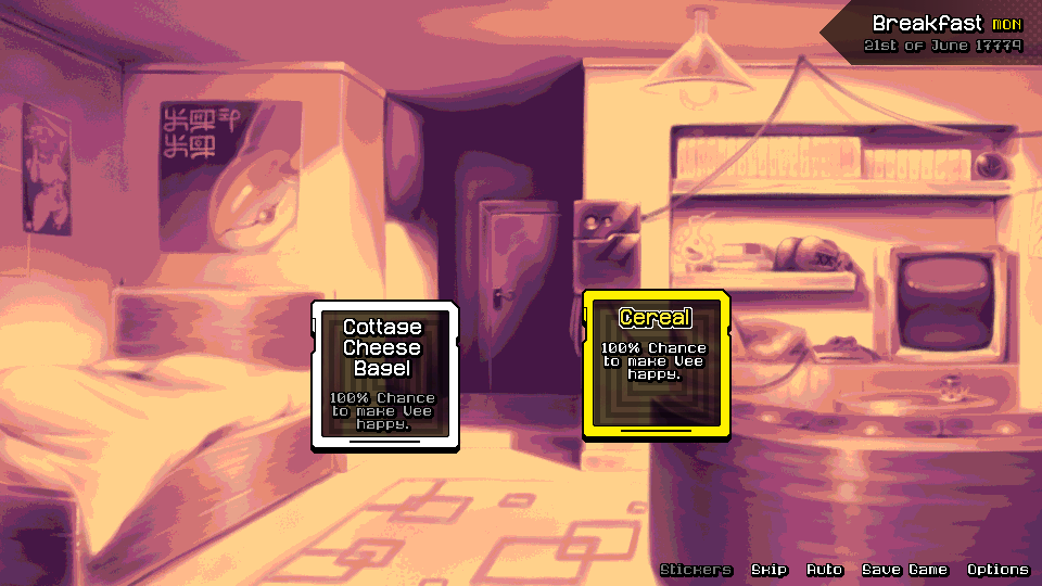
As usual, there's not much I can reveal except cryptic screenshots.
I told you there's be weird new gameplay gimmicks though, and here they are.
What could it mean? Where am I going with this...? Perhaps one day you'll find out...
Well, there are still plenty more changes that need to be made to the game to accommodate the feedback from the survey. I'm really quite glad that I got that all done before working on r5, and especially r6.
Perhaps the most important thing I learned was that people are genuinely invested in the direction that I've been taking things in. It's so relieving to know that I made the right choices when it came to game design, and that what I have in mind for the game's finale might just really work.
Well, assuming I don't totally fuck it up.
No promises,
Marina